San Pellegrino recently revealed a product refresh for their flavoured sparkling water range now called ‘Naturali’, along with a new format and visual identity.
According to the brand, this refresh is more authentic, more premium, more sustainable, more stylish – with the same unmistakeable taste experience.
Whether you love or hate the new packaging from an aesthetic point of view, there are a few concerns from a neuromarketing perspective.
One of cornerstones of packaging design is based on Weber’s Law which states that an additional level of stimuli known as the ‘Just Noticeable Difference’ is necessary for most people to perceive that there is a change in the design. The job for neuromarketing research is to test this ‘Just Noticeable Difference’- to see if the brand/product is still recognisable and if the new design has improved the overall appeal.
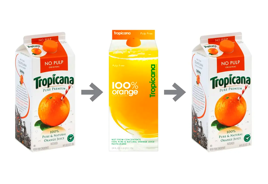
Given that most people shop on autopilot, where low-involvement processing dominates, it’s vital that any new design is still clearly recognisable within the first few seconds. If not, it runs the risk of being a Tropicana-style disaster – where a radical redesign cost the brand $30million in lost sales, before they quickly u-turned back to the old design.
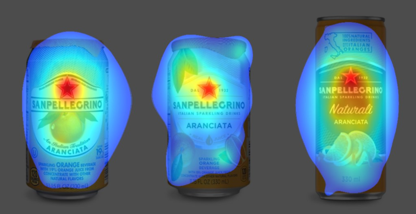
San Pellegrino’s packaging design
In this new design, San Pellegrino has radically shaken up a lot of their brand assets, including the format.
The human brain is wired to see structure, logic, and patterns: it helps us make sense of the world. We use shortcuts to piece together visual information to create a scene and therefore do not see all the smaller details, only what is salient. Key brand assets work as shortcuts to brands and include colours, slogans, sounds or shapes. Achieving the required level of distinctiveness and saliency requires reinforcement and refreshment over time.
There are arguments for and against the change in shape. It has been shown that curvier rounder shapes emphasise sweetness whereas more angular sharper shapes represent more sour or bitter taste profiles. The new tall slim shape more likely to be a move away from sweet to the latter. However, a taller, more slender shape also allows for the bubbles to travels up more sharply – creating a more powerful effervescent sensation (the reason we drink champagne from flute glasses).
One of the most dramatic changes is the removal of the hygiene seal on top of the can. Not only was the seal a distinctive asset, setting the brand apart from the competition, I suspect the physical motion of removing the seal was done intentionally to mimic the peeling of fruit skin – borrowing natural cues from fruit.
The removal of the whole fruit and leaves is also somewhat worrying, as not only did that help to recognise the brand, but it also dialled up fresh fruit associations that are important for both taste and health motivations.
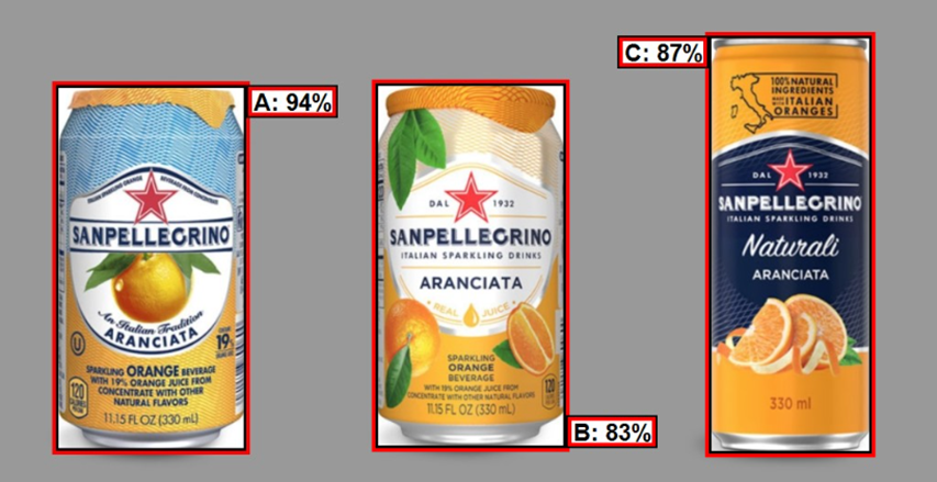
Whilst the move from a white to a darker background was most likely done to premium-ize the brand, it adds more complexity to the image, reduces the contrast of the overall brand logo and creates a less harmonious flow overall, reducing clarity.
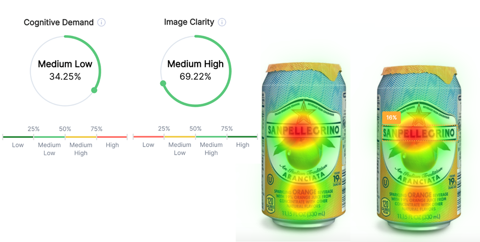
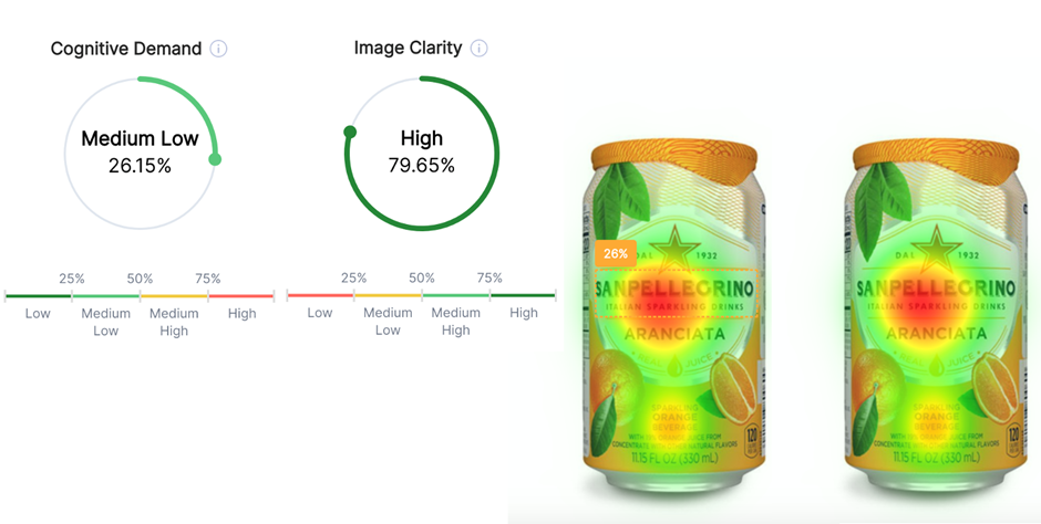
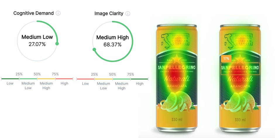
From the visual saliency scores below, we can see that cognitive demand has increased and image clarity has reduced with the new design. In a shelf set mock-up, the original design with the blue background has the highest pop-out, suggesting it would attract the most visual attention.
When re-designing packaging, neuromarketing research techniques can help reduce the subjective bias from traditional research and help optimise your design for strongest impact and appeal.
Find how we use Neuromarketing to inform packing design
We’ll be discussing this and more in the upcoming HeyLab Neuromarketing Packaging Hack. Sign up today to book your spot!